Our Partners and The Experiences We Help Create
Centene Corporation

Overview
- Expand design assets of Design System
- Create multiple new product pages for both B2C and B2B.
- Update current projects to reflect state regulation and business requirements.
- Manage handoffs of designs to development through launch.
The Opportunity
- Ensure that all products meet state-regulated accessibility standards for both B2C and B2B by utilizing a robust Design System.
- Maintaining design consistency across products while keeping the focus on enhancing the user experience.
- Improve communication practices for better information-sharing among team members and established a strong leadership foundation to strengthen future design thinking processes.
The Outcome
We ensured that all products met state-regulated accessibility standards for both B2C and B2B by implementing a comprehensive Design System with detailed documentation. Our approach maintained consistent design across all products, while prioritizing an exceptional user experience to align with business goals. Additionally, we enhanced communication practices, streamlining the sharing of information among team members and establishing a solid foundation for strong leadership in future design thinking processes. These solutions set the stage for a seamless workflow and a commitment to delivering high-quality, user-focused products.
Cetera Wealth Management
Overview
- Organize the design system in Adobe XD to improve team efficiency.
- Initiated the migration of the design system to Figma for better collaboration.
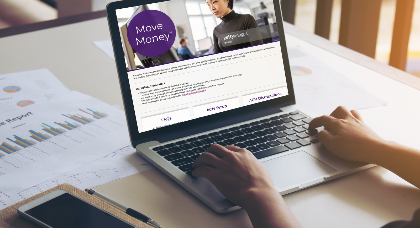
- Developed a new product allowing users digital signing solution to enhance client document workflows.
- Create new single page online marketing materials.
- Update current products to maintain compliance.
The Opportunity
- Identify the need for unique designs for specific product pages not utilizing the existing design system.
- Created new assets tailored to product pages
- Improve effective design solutions.
The Outcome
The organized design system and the development of Click-2-Sign significantly improved the efficiency of client document workflows. The successful migration to Figma facilitated better collaboration among team members, positioning the design system for future scalability. Ultimately, our efforts enhanced the brand’s identity and usability across various platforms.
Mayo Clinic

Overview
- Conduct user research for new and current products.
- Create and implement updated user flows, wireframes, prototypes, and UI specifications to guide development for products.
- Expand the design system.
The Opportunity
- Conduct user interviews and usability studies during each project phase to refine the design process and enhance results.
- Update design system assets and established a comprehensive design system for consistent and scalable product development.
- Create a new client-facing products, the Surgical Viewer, to assist surgeons in assessing patients for surgery, showcasing the lifecycle of patient treatments.
- Improve the design of surgical calculators for better accessibility and efficiency, reducing user time spent on the tool.
The Outcome
As a result of our efforts, we successfully launched the Surgical Viewer, which significantly streamlined the process for surgeons to assess patients’ treatment histories. The improved surgical calculators enhanced accessibility and reduced user interaction time by 30%, leading to more efficient workflows. By establishing a scalable design system, we provided a solid foundation for future product growth and consistency, receiving positive feedback from both end-users and stakeholders. The project not only met user needs but also exceeded client expectations, driving higher satisfaction and efficiency across the board.
Optum | United Health
Overview
- Support mobile and web product completion ahead of a Q4 deadline with rapid prototyping and usability-focused design.
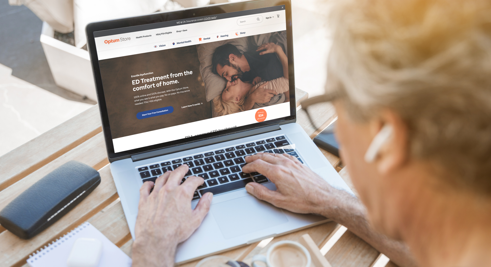
- Design new responsive web interfaces for two key product pages, ensuring brand consistency across devices.
- Collaborate with cross-functional teams to meet deadlines and integrate designs seamlessly.
The Opportunity
- Prototype completed UIs, ensuring accurate reflection of user flow and design logic for stakeholder presentations.
- Develop interactive prototypes and high-fidelity mockups to enable user testing and gather valuable feedback.
- Design two B2C product page interfaces, refining wireframes and delivering high-fidelity UIs ready for development.
The Outcome
The prototypes were well-received by stakeholders, enabling valuable feedback and timely product alignment. User testing of the designs highlighted enhanced usability and user engagement, which informed iterative improvements. The final designs successfully met business objectives, providing an intuitive, cross-device experience that improved product performance.
Cooks Children’s Hospital

Overview
- Partner with the designers currently responsible for Cook Children’s Hospital to help meet deliverable deadlines.
- Ensure the MVP for the in-bed patient experience app was ready for launch.
- Designe new wireframes and UI specifically for in-bed patient use.
The Opportunity
- Conceptualize features and user journeys for an in-bed patient experience app to enhance navigation and medical record access.
- Establish a foundational design system to eliminate inconsistencies in current design styles.
- Complete and improved existing wireframes, introducing new patient-centered features for a better user experience.
The Outcome
Our work resulted in the successful launch of the MVP, with all deliverables completed on time and exceeding expectations. The new in-bed patient experience app significantly improved navigation and medical record access, receiving positive feedback from both patients and hospital staff. Additionally, the design system we implemented provided a cohesive and scalable framework for future app updates, ensuring consistency across all digital products. This ultimately contributed to higher patient satisfaction and a more streamlined in-hospital experience.
New York Philharmonic
Overview
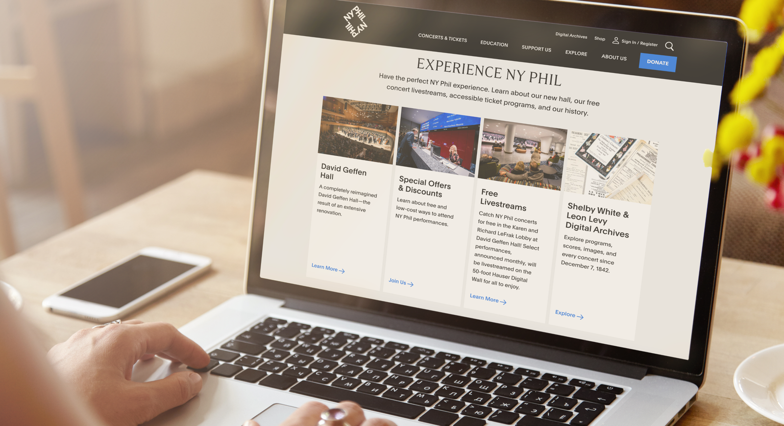
- Collaborate with the New York Philharmonic to reskin web content,
- Redesign user journeys
- Wireframe new User Interfaces.
The Opportunity
- Lead discovery sessions to align stakeholders’ goals and design outcomes.
- Present new concepts for on reskinning beyond stakeholders’ expectations.
- Redesign the website’s information architecture and navigation to present content more effectively.
- Update header and footer to create a more streamlined and purposeful user experience.
- Introduce a modern concept that present overall improve experience for users.
The Outcome
Through consistent collaboration and stakeholder management, we successfully delivered a refreshed design that improved navigation and user interaction. The new design not only updated the visual identity of the website but also enhanced the overall user experience, meeting client expectations and leading to positive feedback from both the team and end-users.
Wells Fargo

Overview
- Recreate their design system in Figma into Invision.
- Update the responsive designs of both data tables and UI headers to align with modern design standards.
- Graphic design of branding materials
The Opportunity
- Create an impactful logo designs and branding materials.
- Create new design system assets and improve current design components for faster implementation of design for new products and brand consistency.
The Outcome
The transition to Figma streamlined the workflow and significantly improved design consistency. Our updated design kit provided a unified system that enhanced collaboration across teams. The ADA-compliant components ensured accessibility, and the new system met both design standards and business goals.
Sunbit Banking
Overview
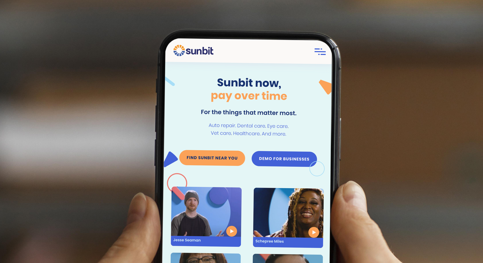
- User research including conduct moderated user interviews and usability studies for a new B2C mobile banking application and comparative and designs audits.
- Design a new product from concept through design cycle for handoff to Sunbit’s own design team. .
The Opportunity
- Create a new unique product for banking industry to help Sunbit offer a user experience independent of other banking applications.
The Outcome
We successfully completed the project on time, with positive user feedback driving continued development. The final design, refined by user insights and stakeholder input, improved the overall user experience, meeting the client’s goals and setting a strong foundation for the product’s future growth.
IT Yug
Overview
- Create brand identity.
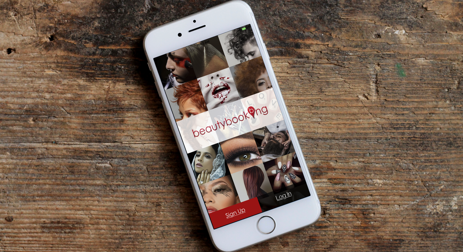
- Design a new BeautyBooking mobile application and website.
- Build new design system.
- Conduct all phases User research.
- Support design development through launch.
The Opportunity
- Conduct discovery sessions and research to understand client needs and define project scope, functionality, and timeline.
- Redesign the all branding materials that is influenced from research.
- Recreate a new responsive website and mobile application and suggest innovative features and functionality.
The Outcome
Testing the updated flows with returning and new users resulted in positive feedback, validating our approach. Stakeholders approved further wireframe development, and we enhanced the design with color for improved clarity and user navigation. These updates led to a smoother, more intuitive interface, driving user satisfaction and business success.

