
Jon Hill
AI-Native Product Design | Systems UX | Adaptive Experiences | View Resume
I design complex digital products across enterprise and consumer platforms, using AI as a decision-support tool to improve clarity, scale, and user outcomes.
With 13 years of experience, I lead scalable digital product initiatives through UX research, design systems, and thoughtful decision-making.

MedTech Case Studies (Mayo Clinic, Optum/United Health Group, Cooks Children Hospital)
Healthcare UX Case Study
Mayo Clinic + Optum / UnitedHealth Group + Cook’s Children Hospital
Designing Healthcare Experiences Around the Information People Need
Healthcare UX can mean very different things depending on who’s using the product and what they need to accomplish. Across Mayo Clinic and Optum, I worked on experiences ranging from complex clinical tools for providers to assessment, medication, and research experiences supporting consumers and healthcare teams.
Three Different Healthcare Environments Presented Unique “Challenges”
Each product required me to solve a different healthcare UX problem—from organizing complex clinical information and patient histories, to designing within established product patterns, prototyping interactions, and structuring a patient-facing mobile experience. The challenge was understanding who needed the information, what they needed to accomplish, how to present that information, and how the experience could make complex healthcare tasks easier to understand and navigate across Mayo Clinic, Optum / UnitedHealth Group, and Cook Children’s Hospital.
My work at Mayo Clinic focused on three products with very different information and interaction needs.
The challenge was determining how to organize complex healthcare information so providers and users could quickly understand what they were seeing and know what to do next.
Design a way for providers to explore a patient’s complete healthcare history across appointments, labs, procedures, surgeries, and other events without losing their place in the larger timeline.
Bring labs, bloodwork, tests, and results together in a consolidated view that allowed providers to quickly understand the information associated with a patient’s visit.
Guide users through an assessment while making the relationship between their responses and the resulting recommendation clear and easy to understand.
As the UX team became smaller, I was balancing these products simultaneously, which required me to prioritize design decisions and rely heavily on collaboration to keep the work moving.
My work at Optum presented a different design challenge. I joined products that were already underway, requiring me to understand existing patterns, interactions, and research goals while contributing to the next stage of the experience.
Determine how existing screens should behave and connect as an experience, including interaction states, transitions, and the appropriate level of prototype fidelity.
Create and iterate on an erectile dysfunction medication experience while learning and applying patterns already established across related product pages.
Prepare screens and interactions for click-through usability and heat-map testing so researchers could observe how users navigated and interacted with the experience.
Because this was a short engagement, understanding the existing product context while contributing to active work became an important part of my process.
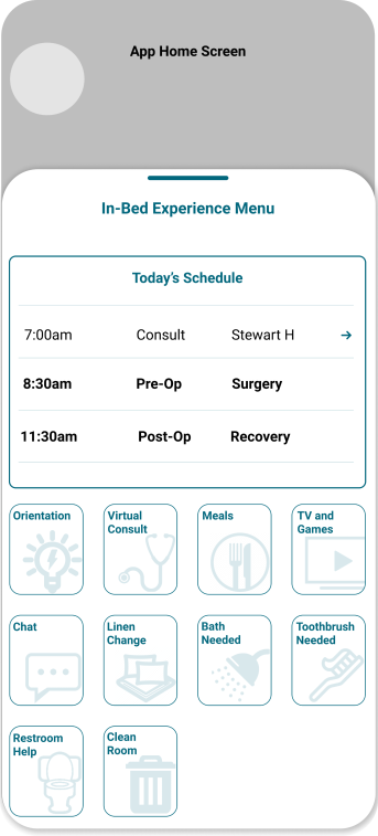
I joined an in-progress patient-facing mobile application as the Information Architect, taking over work that had already been started by another designer. My primary responsibility was defining how the experience should be organized and how patients would move through it, then translating that structure into user journeys and wireframes.
Organize content, features, and patient tasks into a clear structure that made the mobile experience easier to understand and navigate.
Define how patients would move between features and tasks, ensuring individual screens worked together as part of a complete experience.
Turn the information architecture and user journeys into wireframes that communicated navigation, hierarchy, and screen progression before moving further into UI.
Because I joined the project after design work had already begun, I needed to understand the existing direction and determine what should be continued, refined, or reorganized while keeping the project moving forward.
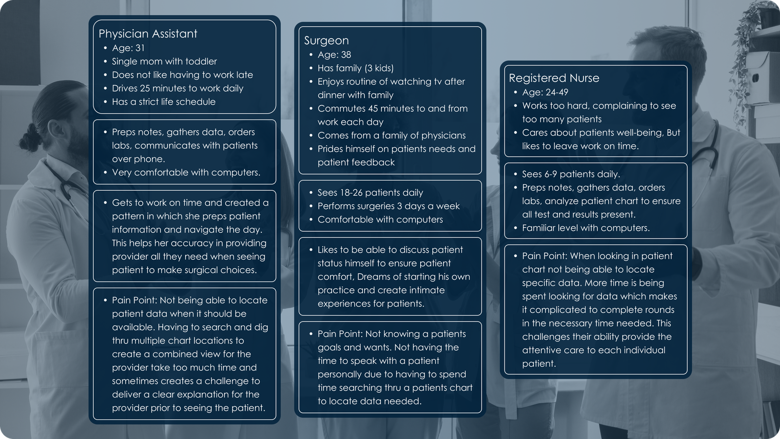
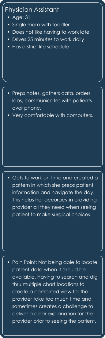
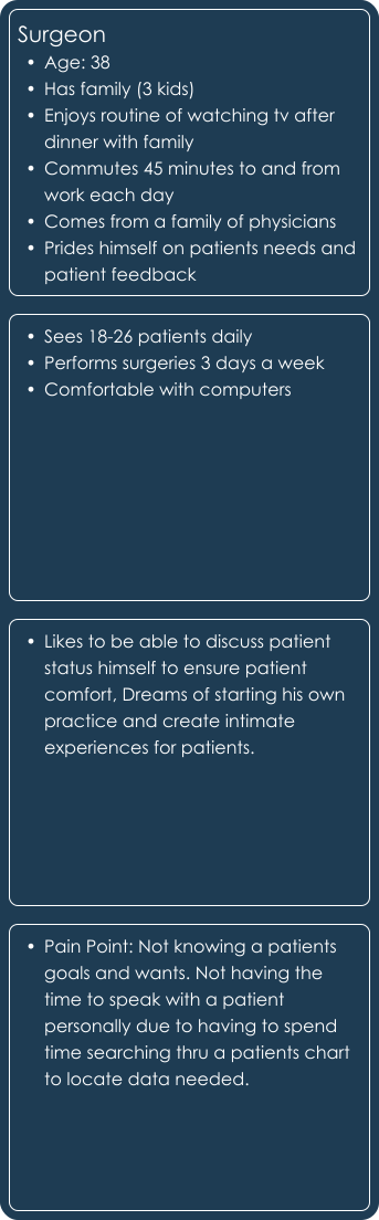
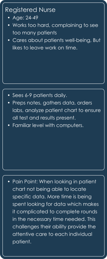
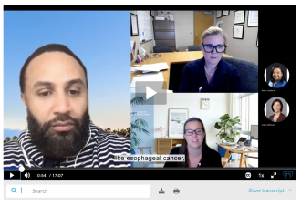
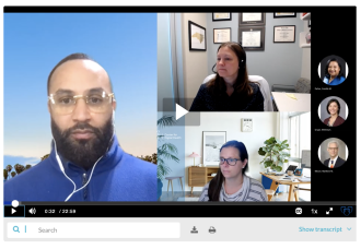
My work at Mayo Clinic included the Health Assessment Calculator, Surgical Viewer, and Patient History Timeline, each requiring a different understanding of how users interact with healthcare information. For the two clinical tools, I conducted user interviews with registered nurses, surgeons, and physician assistants to understand their workflows, needs, and pain points. Those insights helped shape personas and informed design decisions for each product I helped design.
I developed personas to define the healthcare providers we were designing for, then conducted user interviews with registered nurses, surgeons, and physician assistants to better understand their workflows, information needs, and pain points. Together, these research methods provided insights that informed the design direction for both the Surgical Viewer and Patient History Timeline.
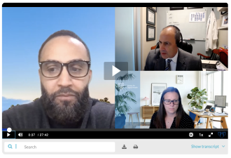
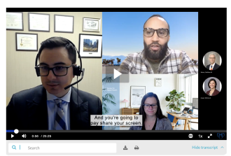
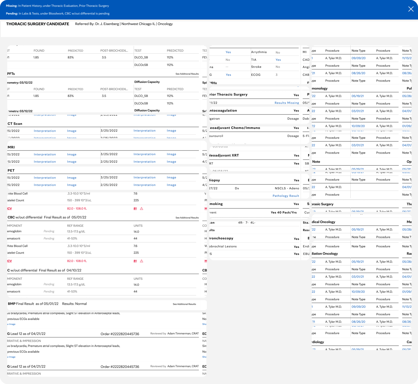
Providers could have labs, bloodwork, tests, and results associated with a single visit spread across different pieces of information. The Surgical Viewer brought that information together into a consolidated experience.
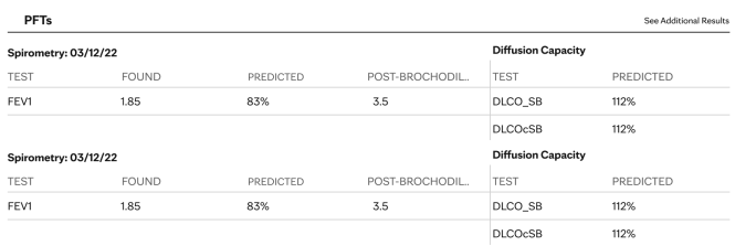
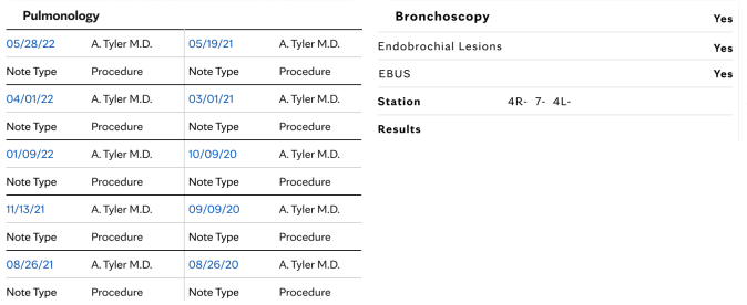
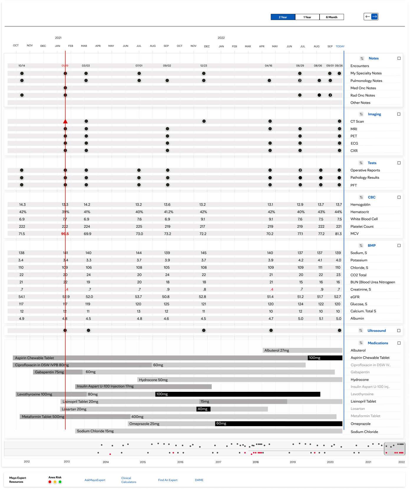
A patient’s healthcare history could contain years of appointments, surgeries, tests, lab work, and other interactions with the healthcare system. The challenge wasn’t simply displaying that information—it was helping providers move through it without losing the larger story of the patient’s care.

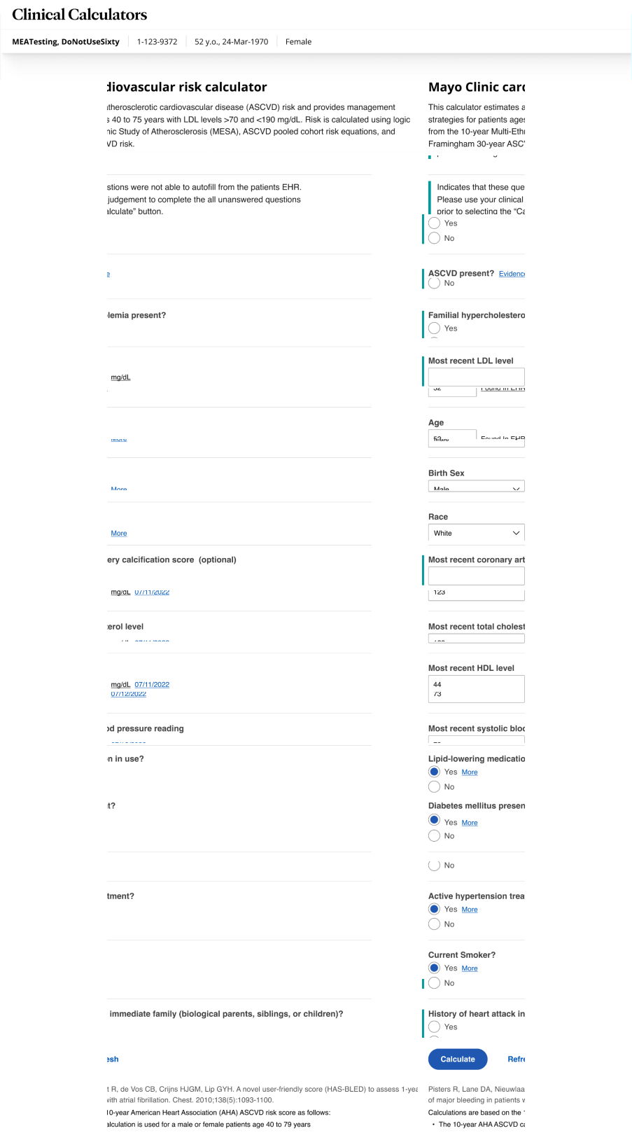
The assessment experience guided users through a series of questions and used their responses to produce a recommended result. Although publicly accessible, the experience was also used by healthcare providers.
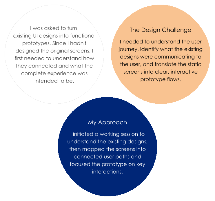
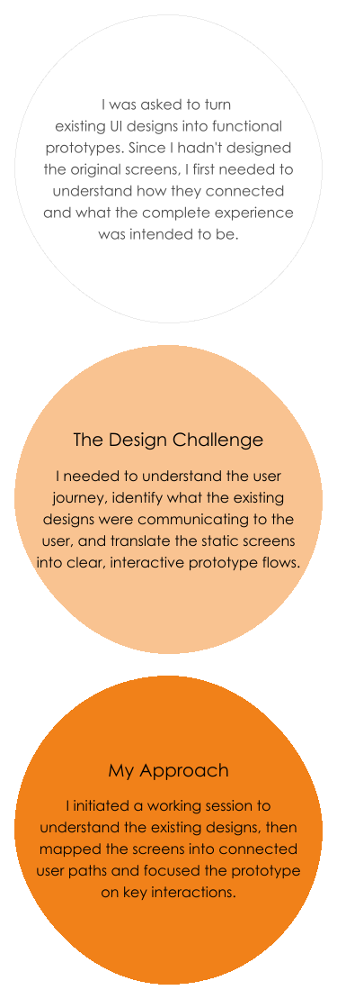
My work at Optum / United Health Group extended across three areas of the product experience: prototyping existing application designs, iterating on a consumer medication experience, and preparing interfaces for usability research. Each required a different UX skill,from defining how an interface should behave, to designing within established patterns, to preparing experiences that could be tested with users.
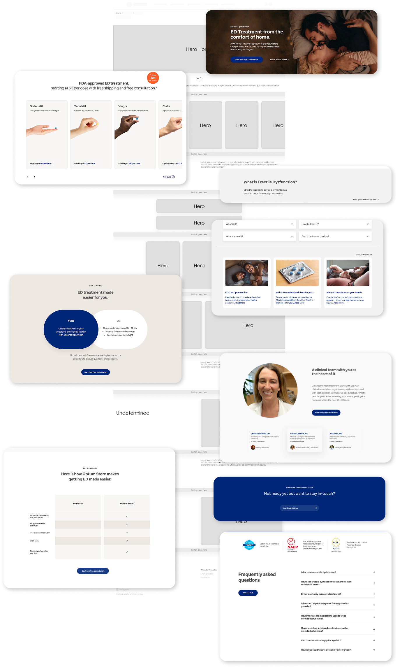
Sample Work — Original designs cannot be displayed due to contractual restrictions.
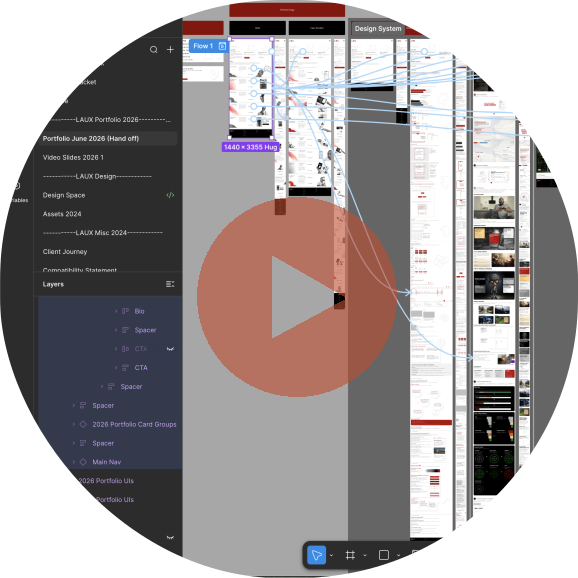
Considering that I was joining an established product ecosystem, I worked with the design team to expedite my understanding of how related pages presented medication information and guided users through the experience.
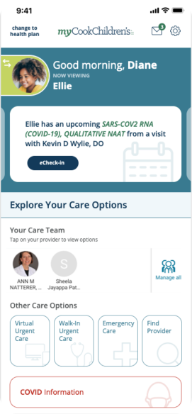
Joining an in-progress patient-facing mobile application came with the interesting challenge of quickly needing to understand what designs were delivered and recognize how to continue to explore what the experience could become.
Focusing primarily on the UX and UI, I was able to dive into research, and expanded exploration while modifying the information architecture to improve creating a cohesive patient experience.
The first challenge was gathering context to make informed design decisions relevant to the design process.
This meant collaborating with the product owner and stakeholders to understand the product’s current direction, review existing deliverables, and identify remaining goals.
That gave me a foundation for exploring the experience with an opportunity to continue its direction.

Now that I see the existing design direction, I decided to validate delivered designs to ensure consistency.
Next, I ideated and explored ways the experience could improve, using undocumented user journeys that I did not see explored in early design concepts.
Working through multiple directions provided the required clarity for future iterations and experience enhancements that could affect the patient experience before committing to developing a solution.
Some ideas worked, some led somewhere completely different, and some politely found their way to the UX graveyard.
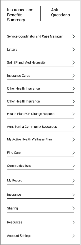
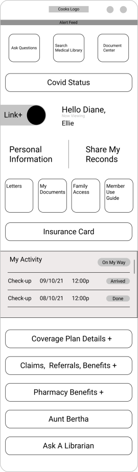
As ideas emerged, the journey and architecture evolved past their original stages. I began finalizing hierarchy, navigation, interactions, screen progression, and the variation of user journeys.
We were able to address gaps, raise new questions, and finalize decisions that helped the team meet deadlines.
Design explorations were primarily conducted in Miro.
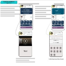
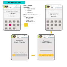
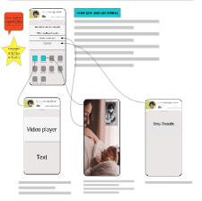
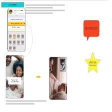
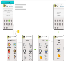
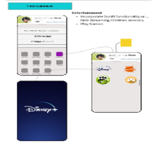
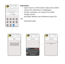
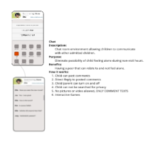
With the experience clearly defined, the team’s explorations became directional, allowing us to work towards more deliverables.
User interfaces clearly communicated the design features and ‘happy paths’ while remaining connected to the larger patient journey.
Unifying the visual hierarchy, content organization, navigation, and interaction patterns simplified the experience for patients.
Design explorations were primarily conducted in Miro.
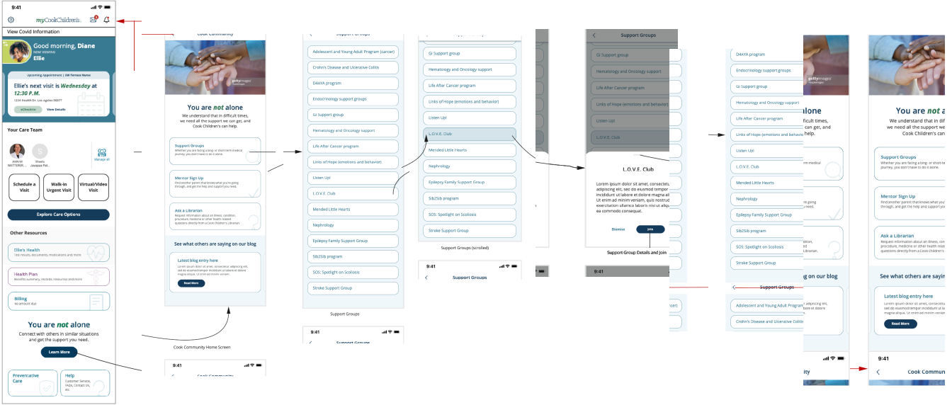
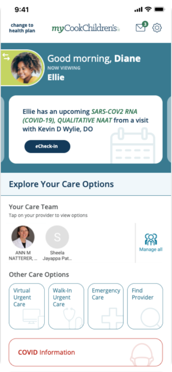
My work at Mayo Clinic focused on three products with very different information and interaction needs.
The challenge was determining how to organize complex healthcare information so providers and users could quickly understand what they were seeing and know what to do next.
Design a way for providers to explore a patient’s complete healthcare history across appointments, labs, procedures, surgeries, and other events without losing their place in the larger timeline.
Bring labs, bloodwork, tests, and results together in a consolidated view that allowed providers to quickly understand the information associated with a patient’s visit.
Guide users through an assessment while making the relationship between their responses and the resulting recommendation clear and easy to understand.
As the UX team became smaller, I was balancing these products simultaneously, which required me to prioritize design decisions and rely heavily on collaboration to keep the work moving.
My work at Mayo Clinic included the Health Assessment Calculator, Surgical Viewer, and Patient History Timeline, each requiring a different understanding of how users interact with healthcare information. For the two clinical tools, I conducted user interviews with registered nurses, surgeons, and physician assistants to understand their workflows, needs, and pain points. Those insights helped shape personas and informed design decisions for each product I helped design.
I developed personas to define the healthcare providers we were designing for, then conducted user interviews with registered nurses, surgeons, and physician assistants to better understand their workflows, information needs, and pain points. Together, these research methods provided insights that informed the design direction for both the Surgical Viewer and Patient History Timeline.
Providers could have labs, bloodwork, tests, and results associated with a single visit spread across different pieces of information. The Surgical Viewer brought that information together into a consolidated experience.
A patient’s healthcare history could contain years of appointments, surgeries, tests, lab work, and other interactions with the healthcare system. The challenge wasn’t simply displaying that information—it was helping providers move through it without losing the larger story of the patient’s care.
The assessment experience guided users through a series of questions and used their responses to produce a recommended result. Although publicly accessible, the experience was also used by healthcare providers.
My work at Optum presented a different design challenge. I joined products that were already underway, requiring me to understand existing patterns, interactions, and research goals while contributing to the next stage of the experience.
Determine how existing screens should behave and connect as an experience, including interaction states, transitions, and the appropriate level of prototype fidelity.
Create and iterate on an erectile dysfunction medication experience while learning and applying patterns already established across related product pages.
Prepare screens and interactions for click-through usability and heat-map testing so researchers could observe how users navigated and interacted with the experience.
Because this was a short engagement, understanding the existing product context while contributing to active work became an important part of my process.
My work at Optum / United Health Group extended across three areas of the product experience: prototyping existing application designs, iterating on a consumer medication experience, and preparing interfaces for usability research. Each required a different UX skill,from defining how an interface should behave, to designing within established patterns, to preparing experiences that could be tested with users.
Sample Work — Original designs cannot be displayed due to contractual restrictions.
Considering that I was joining an established product ecosystem, I worked with the design team to expedite my understanding of how related pages presented medication information and guided users through the experience.
I joined an in-progress patient-facing mobile application as the Information Architect, taking over work that had already been started by another designer. My primary responsibility was defining how the experience should be organized and how patients would move through it, then translating that structure into user journeys and wireframes.
Organize content, features, and patient tasks into a clear structure that made the mobile experience easier to understand and navigate.
Define how patients would move between features and tasks, ensuring individual screens worked together as part of a complete experience.
Turn the information architecture and user journeys into wireframes that communicated navigation, hierarchy, and screen progression before moving further into UI.
Because I joined the project after design work had already begun, I needed to understand the existing direction and determine what should be continued, refined, or reorganized while keeping the project moving forward.
Joining an in-progress patient-facing mobile application came with the interesting challenge of quickly needing to understand what designs were delivered and recognize how to continue to explore what the experience could become.
Focusing primarily on the UX and UI, I was able to dive into research, and expanded exploration while modifying the information architecture to improve creating a cohesive patient experience.
The first challenge was gathering context to make informed design decisions relevant to the design process.
This meant collaborating with the product owner and stakeholders to understand the product’s current direction, review existing deliverables, and identify remaining goals.
That gave me a foundation for exploring the experience with an opportunity to continue its direction.
Now that I see the existing design direction, I decided to validate delivered designs to ensure consistency.
Next, I ideated and explored ways the experience could improve, using undocumented user journeys that I did not see explored in early design concepts.
Working through multiple directions provided the required clarity for future iterations and experience enhancements that could affect the patient experience before committing to developing a solution.
Some ideas worked, some led somewhere completely different, and some politely found their way to the UX graveyard.
As ideas emerged, the journey and architecture evolved past their original stages. I began finalizing hierarchy, navigation, interactions, screen progression, and the variation of user journeys.
We were able to address gaps, raise new questions, and finalize decisions that helped the team meet deadlines.
Design explorations were primarily conducted in Miro.
With the experience clearly defined, the team’s explorations became directional, allowing us to work towards more deliverables.
User interfaces clearly communicated the design features and ‘happy paths’ while remaining connected to the larger patient journey.
Unifying the visual hierarchy, content organization, navigation, and interaction patterns simplified the experience for patients.
Design explorations were primarily conducted in Miro.
 Conclusion
Working across Mayo Clinic, Optum / United Health Group, and Cook Children’s Hospital gave me the opportunity to solve very different healthcare UX challenges, and each project required something different from me, reinforcing that adaptability is a requirement. It’s about understanding the problem in front of me, knowing when to research, explore, collaborate, or iterate, and using the right design approach to make complex healthcare experiences easier for the people using them.